Cover Diagrams:
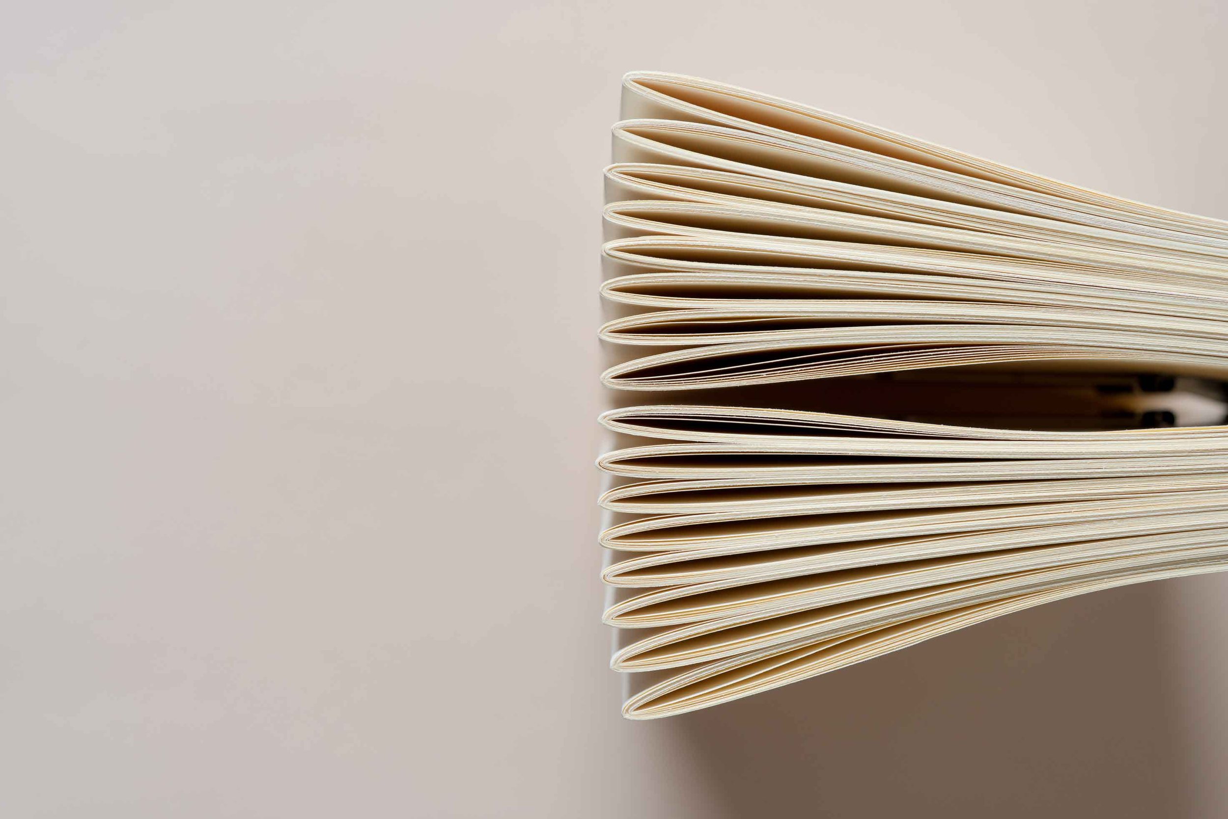
Saddle Stitch Diagram
In saddle stitching, the pages of the book are folded in half and stitched together at the spine using a single stitching wire. This method is commonly used for small books, such as pamphlets or magazines. Sign in or create an account now to download an interactive PDF version of this Saddle Stitch diagram.
Overview & Layout
1-2-3 Cover Setup (Using InDesign)
Create a new document in Indesign. As you see above.
This cover setup example is based on a 5.5" x 8.5" cover with 60 pages of 70# white offset paper.
A The overall width of your book including the front and back cover. In this example, 5.5" + 5.5" = 11".
B This should ALWAYS be just 1 page UNLESS you have an inside printed cover, then change to 2 pages.
C Change value to two columns, set column gutter to “0 in.” (D). This will place guide down center where booklet will be stapled. Keep all essential text and graphics .25" away from the left and right of this guide.
E The margins will mark your safe area. Keep all critical type, logos, graphics, barcode etc. inside this area. While .25" is pretty standard, you could push it to .125" if you want a bit more area.
F Standard bleed is .125". If your cover has a background color or image you want to extend to the very edge of your book, you must extend past the trim line to the bleed. Slight paper shifting is
Here is an example of best practices when designing a cover for your book.
Working With Creep
What is Creep?
Creep, also known as shingling or feathering, happens when sheets of folded paper nested inside each other get pushed out progressively from the outside to the center. If you hold a small stack of printer paper in your hand and fold it in half like a New York slice of pizza, you will see the same effect.
The amount of creep depends on the number of nested sheets as well as the thickness, or “weight” of the paper being used. Generally speaking, creep starts becoming noticeable at 20 pages. The more pages, the more creep. Since saddle stitch booklets are all face trimmed to give a clean, consistent page edge after being bound (stapled) it is important that you are aware that if you have repeating page elements like page numbers, borders or header/footer text that are too close to the trim edge, they may get cut off if layout is not adjusted for creep.
So, What Am I Supposed to Do About This Creep?
No worries, at My Book Printer we deal with creeps all the time. All joking aside, you do have options:
Consider softcover perfect binding. As long as your text bulk (spine) is at least 0.04" thick, you can have your booklet perfect bound. Price difference depends on print run, but is generally modest. To see if your booklet meets the minimum spine depth, enter your specs here.
Have Doc and his minions take care of it for you. For a modest service fee we can make the necessary adjustments to deliver the best possible product.
You can go full blown DIY MacGyver. If you’re using Adobe InDesign for your book layout, we’ll show you how.
Side or Saddle Stitch?
Some advantages to saddle stitching include cost, and the ability to get close to the gutter of the binding margin.
The number of pages that can be stitched depends on how thick the paper is. When the document is too large for saddle stitching, it may be side-stitched.
Adjust for Creep in InDesign
SAFETY FIRST! Before we begin, make a copy of your text file, and differentiate it from the original, maybe add “_Creeped” in the file name. Your file will appear identical to the original, but if saved after output, the creep setting will populate in the print dialog box if you output again.
Keep in mind the intent of this tutorial is to produce a print ready pdf adjusted for creep. If you simply wanted to print a hardcopy to see the adjustment, just print as you usually do after entering the creep value. Producing a pdf will require a couple extra steps including selecting a postscript printer and then opening the .ps file in Acrobat and saving as a pdf. This will be explained in detail.
WHADDAYA MEAN MATH? I’M A WRITER! Not to worry, the math is very simple and you have everything you need right here except a calculator. That is on your phone. There are two things you need to know: 1, the thickness, or caliper of a sheet of paper that you want to print on, and 2, the number of pages in your text. For the caliper of your paper, click here to see the caliper key. This is the formula:
# of pages/4-1 = # of spreads. # of spreads x thickness of paper (caliper) = amount of creep/sheet
The reason the “-1” is in the formula is because the first, outside spread does not need to be adjusted for creep. Our example is a 5.5” x 8.5” booklet with 60 pages on 70lb. White Offset which has a thickness (or caliper) of .005”. SO...
60/4-1 = 14 ➡ 14 x .005" = .07"
If you were adjusting manually, you would have to move elements on each page of a sheet or signature in toward the center .07”. For example, pages 1, 2, 59 and 60 (first, outside signature) don’t need to be adjusted. Pages 3, 4, 57 and 58 need to be moved toward center .07”, and pages 5, 6, 55 and 56 will need to move in .14” and so on until you get to the center spread. Tedious, to be sure. Luckily for you you’re using InDesign and it will do it for you, all you need is that creepy number. IMPORTANT: Whatever value you get from your formula, you will add a negative (-) before it in the print dialog box. A positive value will move elements out to edge of page which is exactly what you are trying to fix, so for our example above we will type -.07 in the creep value window.
In the Print Booklet dialog box, enter your creep value as defined by the formula above using your page count and paper thickness or caliper. Remember to put a negative (-) symbol in front of the value. Under Booklet Type, make sure 2-up Saddle Stitch is selected from pull down.
In the left pane, click on “Preview” and then click on the slider button and drag to the right. It may be very subtle and depends on the number of pages in your booklet and the thickness of the paper, but you will see as you move toward your center spread, your page elements are moving ever so slightly toward the center. Remember, this will ONLY occur in the output, InDesign doesn’t move page elements in your document.
If you see a warning icon next to “Preview”, it means you need to change the paper size and orientation to accomodate the printer spread. If you are unsure what the difference is between a printer spread and a reader spread, click here. The example above is a 4.5” x 6.75” book, so the spread is 9” x 6.75”. New documents in InDesign will default to letter size (8.5” x 11”) and portrait orientation. Click “Print Settings” to make these adjustments.
Under setup, go to the “Paper Size” dropdown and choose the paper that your spread will fit on. In our example Letter size is fine, but the orientation needed to be switched to landscape. Next, under “Page Position” select “Centered”. Be sure “Scale To Fit” is NOT selected.
Next, click on “Marks and Bleed” and select “Crop Marks”. Under “Bleed and Slug”, select “Use Document Bleed Settings” ONLY if your booklet contains bleed. If you are not sure what bleed is, click here. You may want to select “Page Information as it puts the file name and pdf creation date info at bottom. Bleed Marks, Registration Marks and Color Bars the file will be fine if they are selected.
Next, under “General” in side bar, click on the “Printer” drop down and select “PostScript® File”. Under “PPD”, select “Generic PostScript Printer” if you have it. If you do not see this option, you can check to see if your printer is PostScript capable, and if so, download a compatible PostScript print driver or contact us for help.
Under “Paper Size”, select a paper that your printer spread will fit on. As you can see in this example, there are not custom size options, so there may be limitations to what size you can apply this adjustment process. For example, if you had an 8.5” x 11” booklet with full bleed, you would not be able to complete this process with the options above without reducing to fit, since the spread would be 17.25”x11.25” with bleed PLUS the crops.
Take your postscript file and open in Acrobat Pro. You will get a security alert popup. Click “Yes”. Again, be patient, it may take several seconds to open. When it does, go to File, Save As Other, Press-Ready PDF (PDF/X). In the dialog box that pops up, select a location to save your PDF, then click on the “Settings” button at bottom.
In the dialog box that pops up after pressing the “Settings” button, select the “Save as PDF/X-4 radio button, and in the drop down menu, sect the “US Web Coated (SWOP) v2” option, and lastly, under “Apply corrections”, click the option pictured. If you forgot to convert any of your images to CMYK, this “fix-up” will do it for you. Click “OK”.
Congratulations, you’ve done it! That was some fairly advanced stuff you just did there you should give yourself a pat on the back!
SOME PAPER PROS AND CONS
Consider a higher opacity rating carefully if your book has many bold, dark images.
GSM is the metric measurement of paper weight. Pound weight is the Imperial US standard for describing paper weight. GSM is the metric world standard.
Gloss paper offers great ink holdout and images “pop” more than on an uncoated stock. Ideal for a book with lots of color photos or graphics.
Silk offers greater readability for text. Glare-free surface.
Uncoated (White Offset) is primarily for text only publication. A bit more economical.
Cream opaque paper’s warmer tone is easier on the eyes for longer reading. Also a good choice for historical texts. Not appropriate for color photography or graphics but sepia toned images work well.
Sign in or create an account now to download an interactive PDF version of this Saddle Stitch diagram.